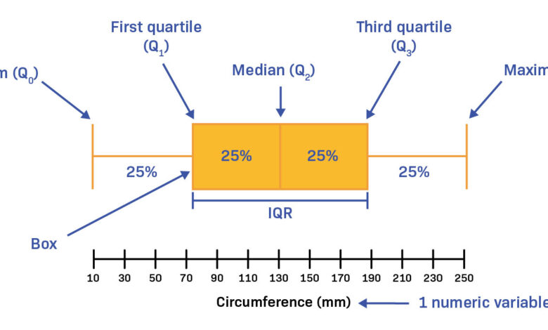
One of the basic abilities in the field of statistics and data analysis is to understand how data is distributed. Although averages and totals give only a superficial insight, they generally conceal important patterns in a dataset. The box plot, which is also known as a box-and-whisker plot, overcomes this issue by offering a concise visual summary based on five statistical reference points. It shows you not only what the typical value is but also how spread out the data is and whether or not there are any extreme values.
What constitutes a box plot?
A box plot is a standard type of chart which shows how a data set is dispersed by means of five summary statistics. The five figures—namely the minimum, the first quartile, the median, the third quartile, and the maximum—combine to make up what statisticians refer to as the five-number summary.
The chart includes a rectangular box drawn between the first and third quartiles, with a line within the box showing the median, together with two lines—which are known as whiskers—stretching out to the minimum and maximum values; any data points that lie outside the whiskers are plotted separately and are regarded as outliers.
Box plots are very useful when it comes to comparing the distributions of various groups since it is possible to put several box plots alongside one another on a single chart without the chart becoming cluttered.
The Five-Number Summary Explained
Each of the five reference points carries specific statistical meaning:
1. Minimum
The smallest value in the dataset, excluding outliers, is known as the minimum and it indicates the lower end of the whisker on the left side of the chart.
2. First Quartile (Q1)
Known as the 25th percentile, Q1 is the value under which 25% of the data lies and it marks the left hand edge of the box. The period between Q1 and Q3 is referred to as the Interquartile Range (IQR) and includes the middle 50% of the data.
3. Median (Q2)
The median is the middle value in a dataset when the values are arranged in order; it splits the data into two equal parts and is more resistant to outliers than the mean, which is why it can be regarded as a reliable measure of central tendency.
4. Third Quartile (Q3)
Q3, also known as the 75th percentile, is the value below which 75% of the data lie and it serves as the right edge of the box.
5. Maximum
The maximum value is the largest value in the dataset when outliers are excluded and it represents the upper boundary of the right whisker.
Taken together, these five points provide analysts with a clear understanding of where the data is concentrated, how symmetrical the distribution is, and the amount of variability present. As part of their training in exploratory data analysis, professionals who are completing a data analyst course in Chennai frequently engage in the interpretation of box plots.
Reading and Interpreting a Box Plot
The shape and proportions of a box plot reveal important distributional characteristics:
Regarding skewness, if the median line is nearer to Q1 then the data is positively skewed (right-skewed) since the higher values push the distribution upwards. If it is nearer to Q3, the data is negatively skewed (left-skewed).
A wide interquartile range (that is, a large box) shows that there is a high degree of variability in the middle 50% of the data, while a small box indicates that the data is closely clustered.
Any points that lie beyond the ends of the whiskers are identified as outliers; such outliers are generally specified as those values which are more than 1.5 times the IQR above Q3 or below Q1. It is important to detect outliers before using statistical models since they can bias the results.
When the median is located at the centre of the box and the two whiskers are of the same length, the distribution is approximately symmetric.
These interpretations are not based on theory; instead they have a direct effect on decisions in quality control, financial analysis, healthcare research, and so on.
Practical Applications of Box Plots
Box plots are widely used across industries for data-driven decision-making:
- Finance: Comparing investment return distributions across asset classes
- Healthcare: Analyzing patient recovery times across treatment groups
- Education: Evaluating score distributions across schools or exam sittings
- Manufacturing: Monitoring process measurements to detect production inconsistencies
In all cases, analysts can readily judge both the typical result and the extent of variation without having to deal with the raw data tables. Students who are taking a data analyst course in Chennai frequently use box plots in real-world datasets as part of their project work, thus reinforcing the way in which these charts operate beyond what is taught in the classroom.
Conclusion
A box plot is a brief and informative method which converts raw data into five clear reference points. It does this by including the minimum value, Q1, the median, Q3, and the maximum, thus giving a full overview of the way in which the data is distributed — covering the spread, skewness, and outliers — all in one compact visual form. For any analyst who is dealing with actual datasets, the skill of constructing and interpreting box plots is essential. Whether you are at the start of your career or are enhancing your analytical abilities by taking a data analyst course in Chennai, becoming proficient in box plot quartiles will improve your ability to explore and present data accurately.