Large-Scale Back Tattoo Typography: How to Plan Multi-Font Layouts Using an AI Tattoo Font Generator
A single word tattooed on the wrist is a font choice. A full back piece with multiple text elements is a typography project. The difference in scale means the difference in complexity — and the decisions you make about font combinations, hierarchy, and layout will define whether your back tattoo looks masterfully composed or visually chaotic.
This guide covers the typographic principles behind large-scale back tattoos with text, and shows you how an AI tattoo font generator can help you plan multi-font layouts before committing to anything.
Why Large-Scale Text Tattoos Need Typographic Thinking
Small tattoos can succeed on font choice alone. You pick the right font for your word, and the tattoo works.
Large-scale tattoos with multiple text elements require something more: typographic thinking. This means making conscious decisions about which text elements are primary and which are secondary, how different font styles interact visually, how the text flows and reads across a large area of skin, and how the text works in relationship to any graphic elements in the piece.
Without typographic thinking, large text tattoos often have the same problem: they look like a collection of individual decisions rather than a unified composition. The eye doesn’t know where to go. The elements compete rather than cooperate.
Good large-scale typography directs the eye, creates hierarchy, and makes the whole piece feel intentional and composed.
Understanding Font Hierarchy
Typography hierarchy is the system of visual differences that tells the viewer which elements are most important.
In a large back tattoo with text, hierarchy typically works like this:
Primary text — the most important word or phrase — is set in the largest size and the most visually distinctive font. It draws the eye first.
Secondary text — supporting words, names, or phrases — is set smaller and often in a complementary but different font. It supports the primary without competing with it.
Tertiary text — dates, small details, brief supplementary elements — is set smallest, often in a lighter or more understated style.
This three-tier system creates visual clarity. The viewer immediately understands what the piece is about because the hierarchy communicates importance through visual weight.
How to Combine Multiple Fonts Effectively
Font combination is where large text tattoos most often go wrong. Here are the principles:
Contrast, not conflict. Effective multi-font tattoos use fonts that are clearly different from each other but feel harmonious. A bold script paired with a delicate serif creates contrast. A bold script paired with a similar-weight gothic creates conflict — the two fonts compete rather than complement.
Maximum two or three font families. More than three font families in a single tattoo almost always looks busy and uncontrolled. Choose two primary font families and use size and weight variations within those families to create hierarchy.
Consistent visual logic. There should be a reason why each font is used for each text element. The primary quotation in the most expressive font. The name in a more personal script. The date in a structured serif. The logic of each choice should feel clear.
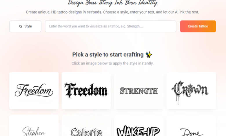
Test combinations before deciding. Use a tattoo font generator to produce each text element in its intended font and then assemble them visually. Seeing the combination together reveals whether the fonts harmonize or clash in ways you couldn’t anticipate by evaluating them separately.
Layout Principles for Back Tattoos
The back is a large, relatively flat canvas with a natural vertical axis. Effective text layouts for backs typically follow these principles:
Work with the spine. The spine is a natural vertical centerline. Text can be centered on it, stacked vertically along it, or arranged symmetrically around it. Designs that ignore the spine often feel unmoored.
Consider the shoulder blades. The shoulder blades create natural compositional anchors in the upper back. Large text elements positioned to interact with or align to the shoulder blades feel anatomically grounded.
Plan for movement. Back tattoos are seen in motion as well as at rest. Consider how the text reads from different angles and distances.
Create breathing room. Large text tattoos need generous spacing. Crowded text across a large area creates visual noise. Generous spacing creates elegance and makes each element easier to read and appreciate.
Using a Tattoo Font Generator to Plan Your Layout
Here’s a practical planning process for large multi-font back tattoos:
Generate each text element separately. Use a tattoo font generator to produce your primary, secondary, and tertiary text elements in their respective intended fonts. Treat each element independently first.
Assemble the elements digitally. Take your generated font images and assemble them in a simple image editor or even on your phone. Create a rough mockup of how the full layout will look. This doesn’t need to be perfect — it needs to show whether the composition feels balanced.
Test the hierarchy. Is your primary text clearly dominant? Does the secondary text support without competing? Does the overall composition direct the eye where you intend?
Adjust and regenerate. Use what you learn from the mockup to refine your font choices and layout. Maybe the secondary text needs to be lighter. Maybe the primary font is too similar in weight to the secondary. Use the generator to test adjustments.
Create a final reference document. Assemble your finalized font choices and layout plan into a clear reference document for your artist.
Collaborating with Your Artist on Large Pieces
Large back tattoos with significant text elements are serious projects that require genuine collaboration with your artist. Your typographic planning provides the foundation. Your artist contributes the anatomical knowledge, the technical execution, and the artistic refinement.
Share your layout mockup early — ideally at a consultation session before the actual tattoo appointment. This gives your artist time to evaluate the plan, suggest refinements, and prepare properly.
Be open to their layout adjustments. An artist who knows how skin behaves, how ink sits across curved surfaces, and how the tattoo will age may suggest layout modifications that improve the final result.
Final Thoughts
Large-scale back tattoos with multiple text elements are among the most complex lettering projects in tattooing. They reward typographic thinking and careful planning — and they suffer significantly without it.
Use an AI tattoo font generator as a planning tool. Generate your elements, test your combinations, assemble your layout. Then collaborate with a skilled artist to bring the composition to life.
The result should feel like it was designed as a whole — not assembled from individual decisions.